Magazine Cover

|
Magazine name: Total film
Film based on: King Kong Header colour palette: White and yellow Main characters/actors: Naomi Watts and Adrien Brody ( Ann Darrow & Carl Denham) In this magazine cover the two actors Naomi Watts and Adrien Brody are dressed in character of their new at the time film "King kong" , which was out in October 2006. The main two characters are placed in the middle of the magazine which places all the attention on them. The characters look frightened as they hold on to each other and stare into the camera. The costume the couple are wearing is similar to what they wear in the film, which is layers. Writing is placed around the two characters with more emphasis on the right as the headers are bigger and bolder highlighting the film "king kong".
At the top of the magazine there is a list of features that are inside. Also on the sides of the film magazine cover key features of the magazine are shown. The background is dark and mysterious as it is blackish with textures of the "King kong". |
|
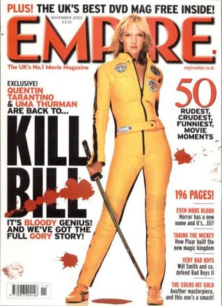
Magazine name: Empire
Film based on: Kill Bill Header colour palette: Red and Black Main characters/actors: Uma Thurman in character In this magazine cover Uma Thurman is shown to be in her character when featured in the magazine. She is shown to be in her most famous outift of her film holding a key prop the big sword. The layout of the page is that the writing is around her as she is placed in the middle. The magazine manages to use the same font from the film when writing 'Kill Bill' so that customers are able to easily recognise the film if reading the headers. This magazine is by one of the biggest film magazines empire which means that the fim must have been significant to get onto it. The background is white and neutral which emphaisises the blood splatters on the header of Kill bill. on a whole this magazine is very affective and eye catching.
|
|
Our Magazine Cover
The magazine project is very creative and unique as it allows for there to be a mix of writing skills and art skills to product a magazine cover which suits the film we had previously created a trailer for and to sort of promote it. The main purpose of the magazine is to promote the film 'Enigma' and so through research done before this was done to its best of quality.
Magazine Name Ideas
To make my magazine cover as unique as possible me and my group decided to create a original name for the magazine rather than copying a header from another top film magazine of all time like Empire. We discussed various name ideas such as;
- Visual magazine
- Visional magazine
- iconographic
- Illustrated
-Big screen magazine
- play house magazine
Our final decision was to go with the idea of Visual magazine as this seemed more sophisticated and edgy and that was the look we wanted to go for. Visual is something which is seen by the eyes and we wanted to symbolise our magazine as being something so interesting when seen by the eyes as it was to do with films which are very visual and iconic. When thinking of Visual as a brand for a magazine I can imagine it as being hugely popular and honoured for its detailed work and interesting knowledge on magazines.
Magazine Images
After exploring the options of possible ways me and my group could choose they layout of our magazine we decided for it to be more light-hearted by using the actor to be himself rather than looking or acting like his actor in the film. This will allow the audience to get to know more about the actor and to get more personal to him. We chose this idea after looking at a few magazines and we found the main magazine we were inspired by in which we decided to produce a similar look to. Rather than just going with copying the idea we took a mixture of pictures so that in case we changed our mind we could work with something else, however this did not happen as after taking a few shots we fell in love with one in particular as it had the right exposure and positioning and simply fitted our theme in every way.
Main Inspiration
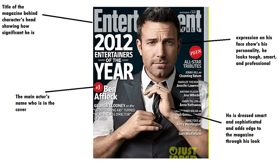
Whilst we were researching different magazines we came across this magazine with the celebrity Ben Affleck helping to advertise the magazine as well as his very successful film Argo. Ben Affleck is out of character here and we can tell this by the fact that he is not in costume, and seems pretty relaxed. The text in bold is clear, and it's focus on seems to be on the highlights of the year of 2012. To attract potential customers, it has a list of famous celebrities and interesting topics to appeal to it's target audience, which seems to be clearly movie buffs. This is clear due to the name mentioning of actors such as Nathan Fillion and Norman Lear- Nathan Fillion in particular has a cult following from the show Firefly by Joss Whedon. Entertainment Weekly is magazine that features interviews with cast members, news and reviews. We can implement idea this into our Magazine cover as we have decided to conduct an interview with our main actor rather then focusing on his role in the film and him being a character.
Final Image

|

|

|
Colour Theme
The colour theme was picked carefully for the magazine as myself and my group member decided to go for a gold luxurious colour as it gave value to the cover and made it stand out with is brightness adding to the black and white touch of the main image. We were inspired by two bond magazine covers which also used this colour to make their magazines stand out.
Title and texts
The titles on the magazines and text are written clearly enough for the audiences to be able to read. The font text used suits and compliments the magazine as it creates a important image, reinforcing the how real the magazine looks, it does not look amateur.
Feature headline
The title of the film is at the bottom of the cover and is placed in a spot where it is noticeable especially since it is in the same font as was used in the trailer and magazine. This is so that customers are able to recognise the film and encourage more awareness about the film so that customers will be able to notice it.
quote preview/pull quote
" A tale of a dangerous obsession" this is a short quote used to describe the film of the enigma and follows the title of the film and the main actor of the film which there is a cover of.
Date and price
The date and price is a common convention of every magazine cover and is essential as it gives information to the audience which is very important. The price is usually written very small so that it doesnt attract much attention so when customers are buying the matgazine they are not mindful of price but of content instead and this is the same with other magazines. our price for the magazine is very reasonable at £2.99 for the great quality produced magazine.
Final Product

Our final product was a complete success as it had all the elements we really wanted to have. It had a great playful, and happy theme due to the main image of our actor as he has a bright sparkly smile. This shows his personality and creates the main atmosphere of the magazine putting focus on him and who he is. This is what the magazine intends to do which is focus on the interview with this actor who is on the cover. The magazine has all the essential and key elements every great magazine cover has which makes it most successful. The header is huge and creates a big impact with the style of font which makes it look professional. Also with the colour theme being black, gold and red adds to the magazine as it makes it look unique and stand out and glimmer in a way. The gold colour has connotations which are luxerious, wealthy, rich and powerful which corresponds to the magazine which will be seen as a huge multi-millionaire magazine company selling loads and featuring a new-coming actor from the film "The enigma" which will be doing great in cinema. The gold reinforces the sucess of the film and suggests that the film is of limited editon or the magazine is. Using inspiration from other magazines the writing on either sides of the main image is very thoughtful and matches the style of the magzine. As my group and I created the text makes it seem more original and new. The magazine doesnt have too much writing which would annoy customers and attratct less and instead by having less brings more focus on the new up-coming actor and his beaming smile. the bar-code and price placed at the bottom are put there to correspond to the normal conventions of every magazine to make the magazine seem more realistic to others. additionally a special feature is put on the magazine which is on the bottom corner sayign " free magazine inside". This is a great way to attract customers as by offering something free to customers will entice them more to buy it. Customers generally like to buy things with special edditions and so this was done to make the magazine stand out especially as it is written in red to make it stand out to the other colours used like gold and black.
